The Tale of Sinuhe
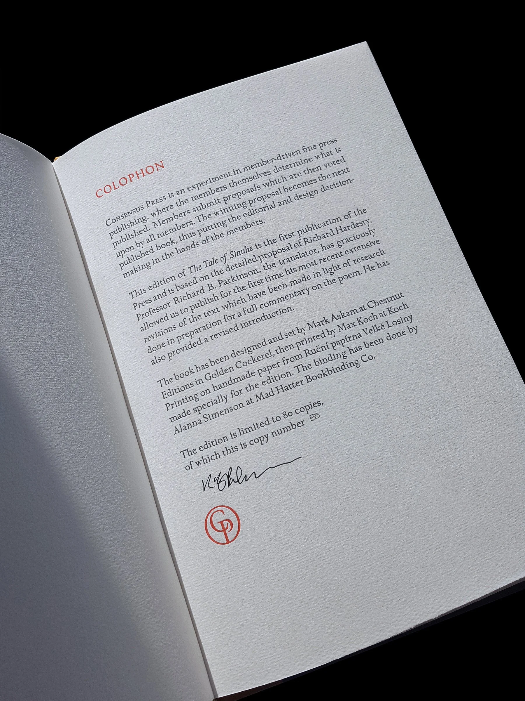
A masterpiece of ancient Egyptian literature, this edition features an original introduction and never-before-published revisions to Prof. R. B. Parkinson’s definitive translation. The text was set by Mark Askam, using a variant of Golden Cockerel adjusted specially for the edition. The book was printed letterpress by Max Koch on handmade paper from the Ruční papírna Velké Losiny in Czechia made to our specifications, and bound by Alanna Simenson.
Our first edition, proposed by Richard Hardesty. Eighty copies.
Member newsletter for The Tale of Sinuhe.
Photos by Mark Askam
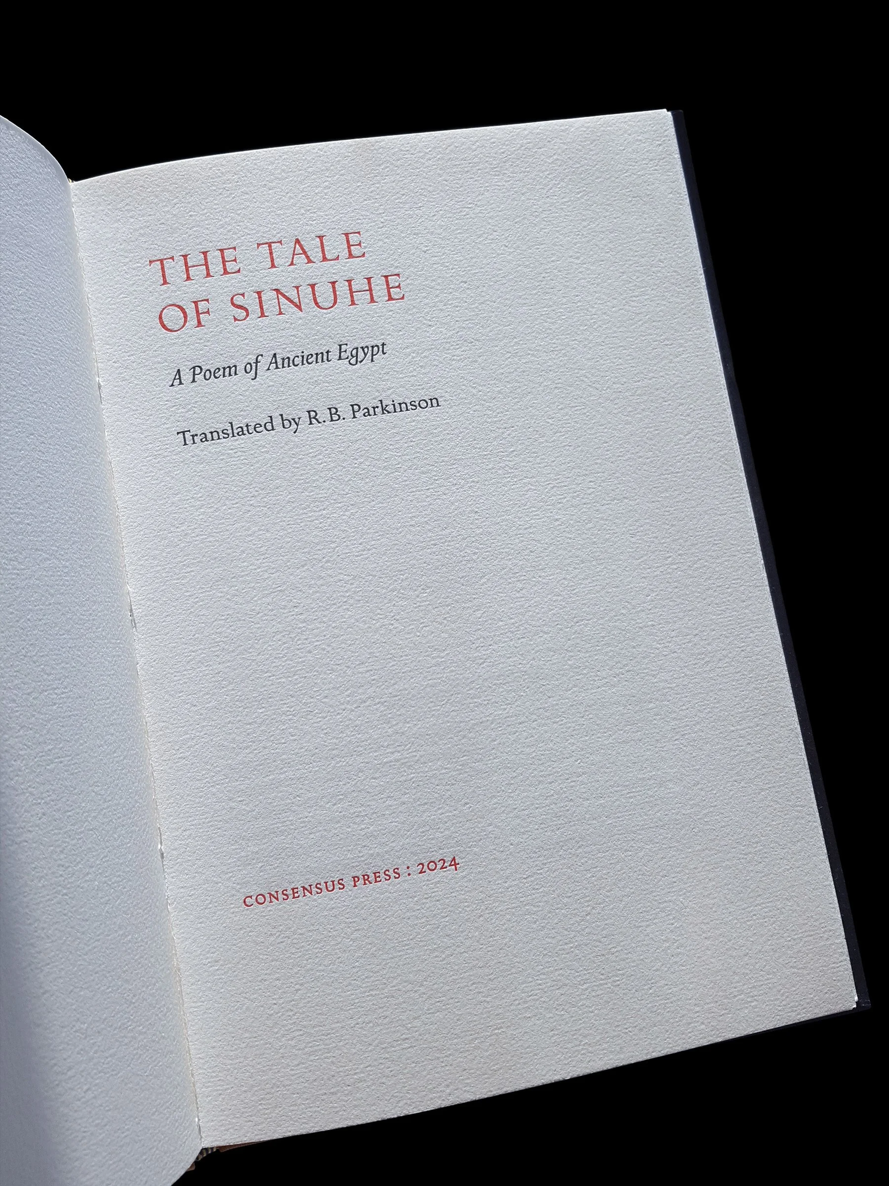
The Tale of Sinuhe
Review by Jaimie Murphy
Parenthesis, Journal of the Fine Press Book Association, Issue 50, Spring 2026, p. 53.
When I worked as a commercial graphic designer many moons ago, there was one particular process that was avoided at all costs: the dreaded design by committee. With that sentiment firmly in my mind I had trepidations about this book, but how wrong I was. When a group of devoted collectors and practitioners set out to test the limits of collaborative publishing, they rarely achieve something as coherent or as beautifully realised as The Tale of Sinuhe, the inaugural volume from the newly established Consensus Press.
Emerging in 2022 from the combined enthusiasm of 176 online respondents to a simple proposition – could a press be governed by its members? – the Consensus experiment is as much a statement about community as it is about the printed word. The premise was audaciously democratic: each member would submit a proposal, review, and vote upon others’ submissions, and the selected work would then be funded through advance purchase by the membership itself. Such a model, at once participatory and self-sustaining, dispenses with traditional hierarchies of publisher and patron. It positions the fine press not as a singular artistic vision but as a collective deliberation about what texts deserve attention and in what manner. The early attrition of membership, from 176 to a stable 72, underscored that commitment; those who remained did so out of conviction in the idea of this shared enterprise.
The resulting debut, The Tale of Sinuhe, proposed by Montana-based member Richard Hardesty, exemplifies both the intellectual curiosity and the aesthetic ambition of this cooperative model. Hardesty’s proposal, which sought to redress the imbalance in fine press treatments of ancient literature, stood apart for its emphasis on the neglected corpus of Egyptian texts. While Greek, Roman, and Mesopotamian classics have long enjoyed typographic reverence, the literary art of pharaonic Egypt – particularly Sinuhe, a text often regarded as that civilization’s masterpiece – has rarely been granted such attention.
In selecting the 1997 Oxford University Press translation by Egyptologist Richard B. Parkinson, rather than the public domain version by Alan Gardiner, the press also signaled its seriousness about contemporary scholarship. Parkinson’s readiness to revise and refine his own work for this edition elevated the project beyond a reprint to the status of a newly authorized text. This gesture of scholarly collaboration mirrors he ethos of the press itself: an ongoing conversation between experts, artisans, and readers. As the narrative of Sinuhe moves between exile and return, fear and reconciliation, it finds a fitting metaphor in the very process by which this edition came into being: a story of wandering, international ideas brought home by a group of dedicated hands. Hardesty’s correspondence with Parkinson and the iterative proofreading by volunteer members echo the communal ritual implied in the text’s funerary origins. The tale, inscribed on tomb walls for the edification of passers-by, becomes here an emblem of endurance: an ancient voice rearticulated through modern craft.
If the origins of The Tale of Sinuhe at Consensus Press testify to the vitality of cooperative publishing, the book’s material realisation demonstrates a correspondingly rigorous devotion to typographic and tactile sumptuousness.
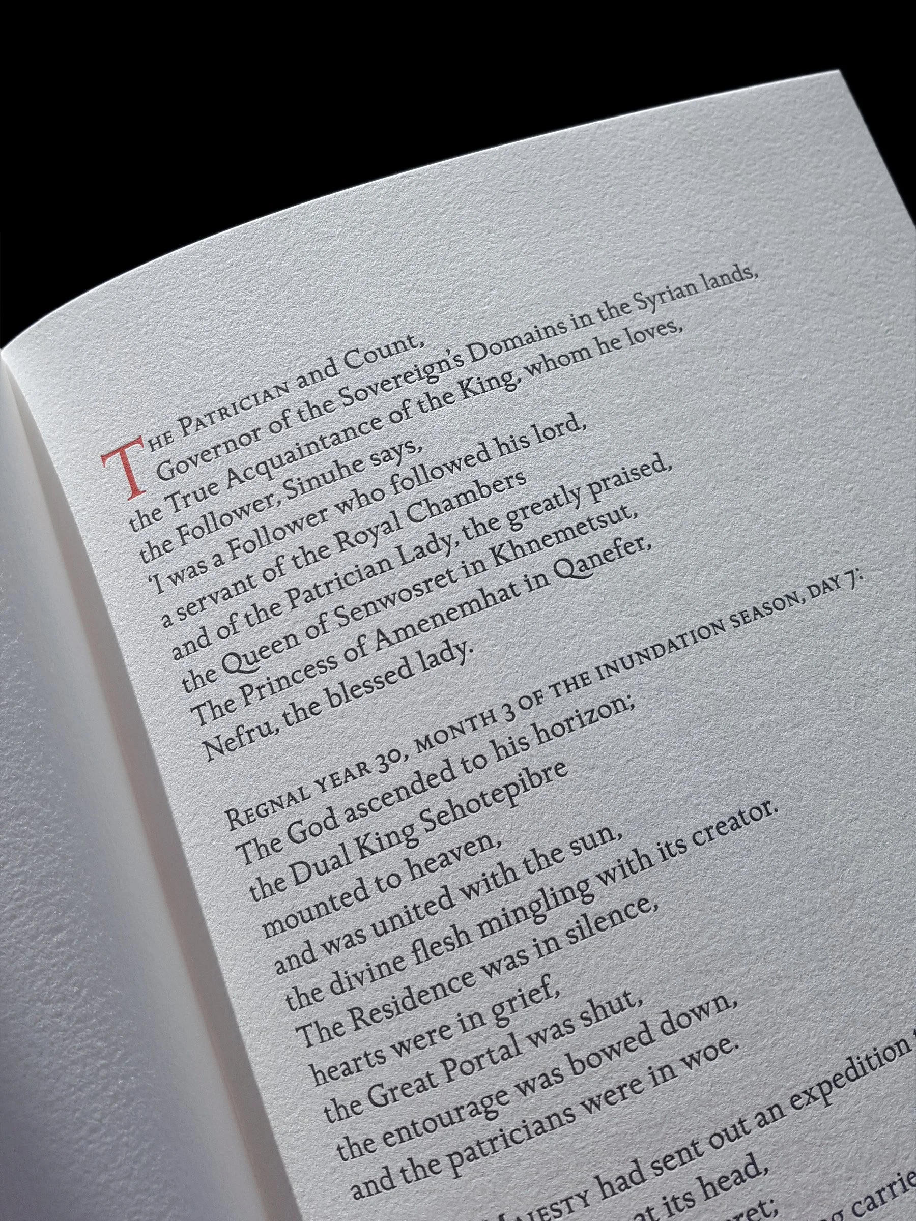
Designer Mark Askam (avid collector and proprietor of Chestnut Press, UK) worked from Hardesty’s detailed specifications to create a typographic setting that displays both clarity and historical resonance. The use of ITC’s 1996 revival of the Golden Cockerel type (Eric Gill’s 1929 design for Robert Gibbings) invokes a lineage of English fine press printing. The task of reintroducing ligatures and small caps, absent from both the original and the digitised designs, speaks to Askam’s attentiveness; these subtle interventions restore a rhythm and balance befitting the work immensely.
The poem’s irregular stanza structure, reflecting the idiosyncrasies of the ancient Egyptian line, is marked by the use of small capitals for the opening three words of each stanza. This device elegantly aids legibility. Such design decisions, while understated, demonstrate the press’s understanding of typography as interpretation, not mere ornament.
The book’s physical proportions, an octavo measuring 7 ½ x 11 inches, arise directly from the chosen paper, as 175gsm handmade produced at the Ručni, Papirna Velké Losiny in the Czech Republic, a mill with over four centuries of paper-making heritage. This decision again embodies the consensus spirit: every aspect, from paper weight to page size, was a collective decision. The result is a page of subtle but substantial presence and luminous texture. Printing, entrusted to Max Koch in Austin, Texas, links the project to a transatlantic lineage of craft. Koch’s two-colour letterpress work, executed with beautiful consistency across the edition of 80 copies, achieves both richness and restraint.
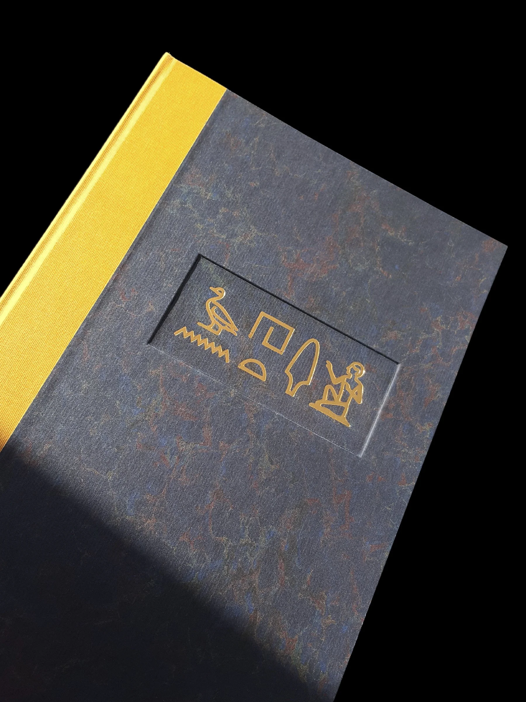
The binding has been completed by Alanna Simenson of Mad Hatter Bookbinding in British Columbia. The chosen colours – yellow for gold and blue for lapis lazuli – pay homage to the materials most cherished by the Egyptians themselves. The yellow buckram spine over rich, dark blue printed marbled boards, is complemented by a gilt hieroglyphic title designed by Professor Parkinson, fusing scholarly authenticity with symbolic delicacy. Unfortunately, this recessed panel seems, at least to this reviewer, an unnecessary and poorly executed addition.
With The Tale of Sinuhe, Consensus Press has achieved more than a debut volume; it has demonstrated the viability of a member-driven fine press that balances erudition with aesthetic integrity. Should the experiment continue, and fervently hopes it will, it may stand as a model for how community, craftsmanship, and care can coexist, of only by consensus.
Jamie Murphy is the proprietor of the Salvage Press and is also the letterpress printer at the National College of Art and Design in Dublin, Ireland.